MOORS Logo & Branding

Intro
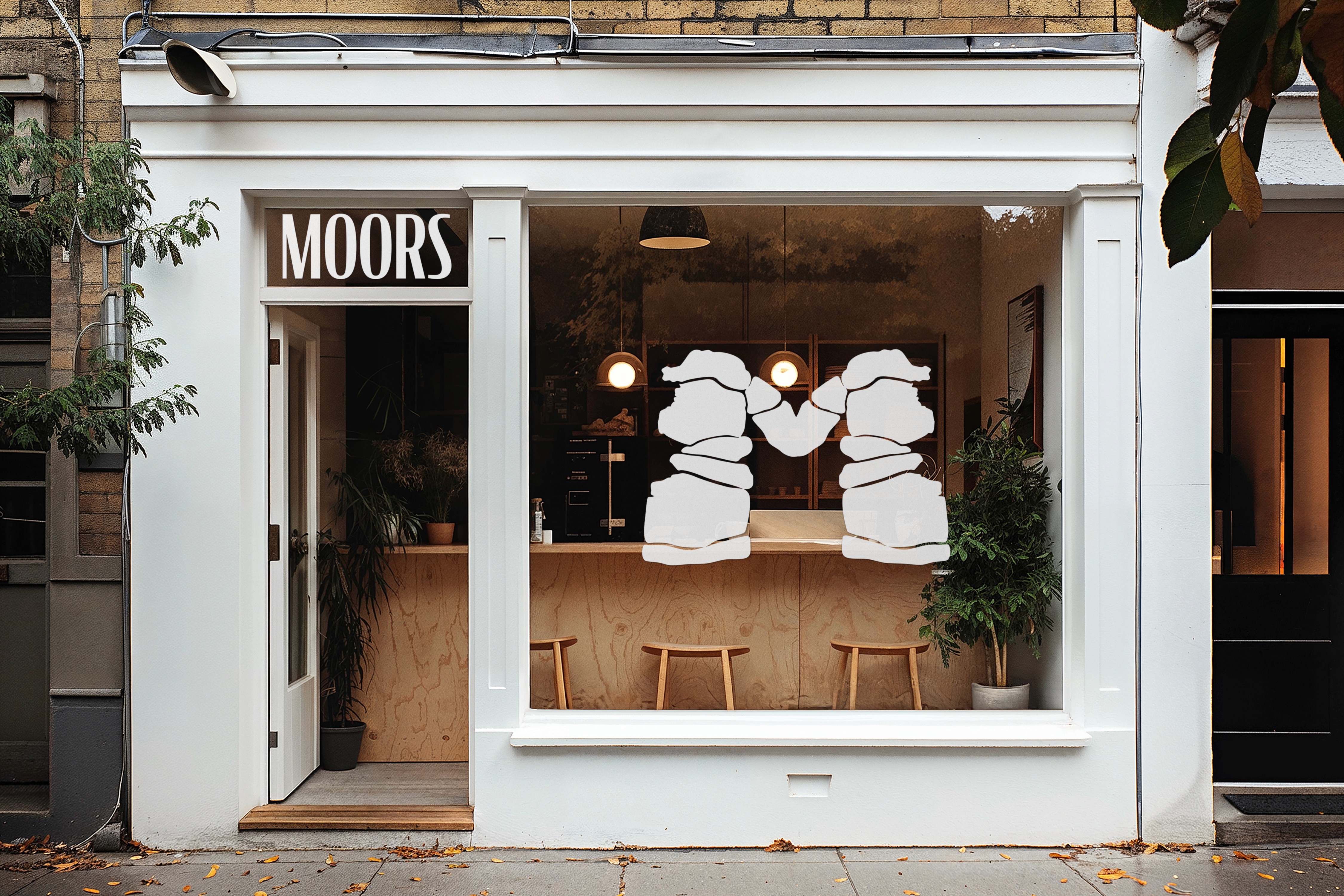
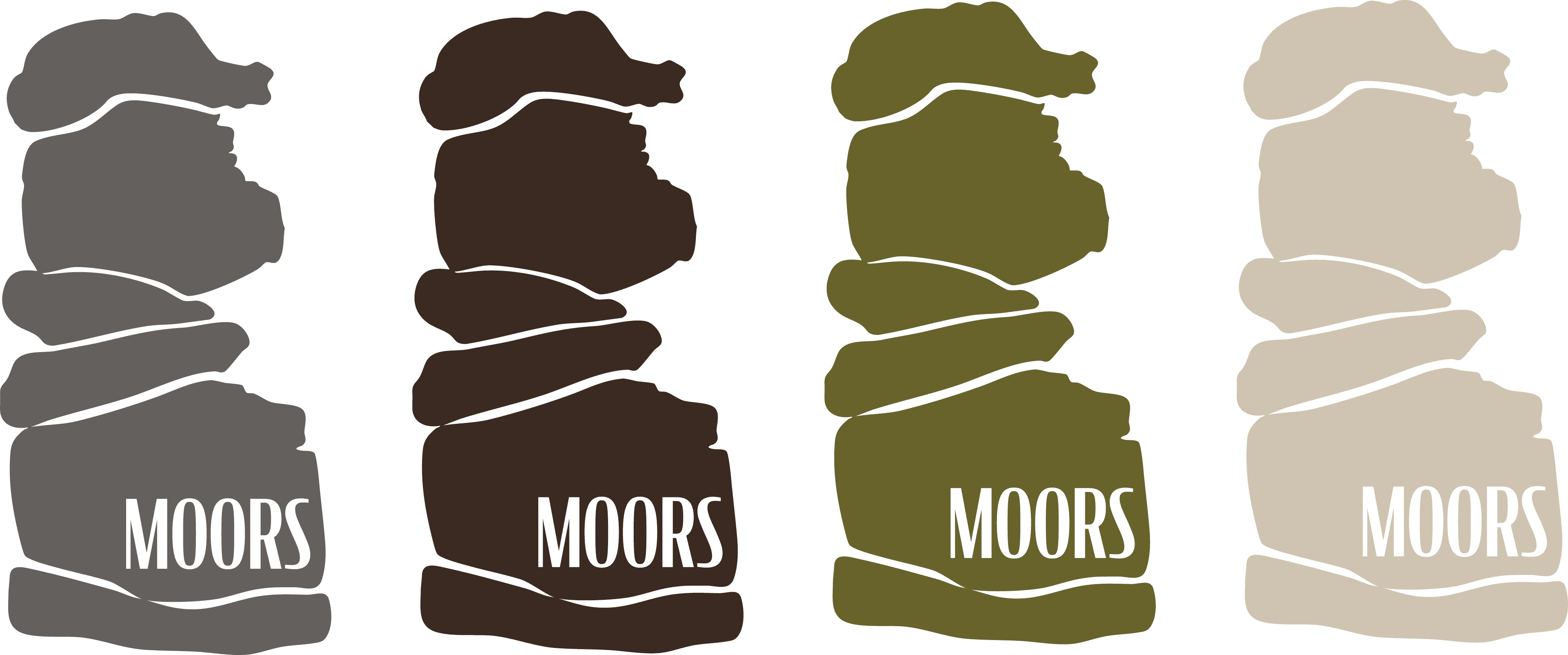
Logo design and branding for MOORS, an artisan bakery based in the South West of England. Inspired by the shape and landscape of Bowerman’s Nose, the identity transforms natural rock formations into an abstract logo mark that feels both grounded and sculptural. The colour palette draws directly from the surrounding moorland, using muted greens, earthy browns, soft beige and stone grey tones to reflect the landscape and atmosphere of the region. Applied across packaging and brand touchpoints, the visual identity aims to feel warm, organic and quietly contemporary while staying rooted in place and local character.
Deliverables:
Art Direction
Event Design
Photo Editing
Branding
Year
/
2026
Client
/
MOORS Bakery